01 Research 02 Ideate 03 Design 04 Learnings
Headspace – redesign landing page
Problem: As a wellbeing product, the landing page should feel calming, attentive, and supportive. Instead, it feels transactional and content-driven. The app shows sessions, but it does not show enough interest in the user’s current state, goal, or personal process.
Goal: Help an infrequent customer to start a new meditation immediately, or a soundbath or other session by making them feel welcomed and guided.
Landing Page Redesign – UX/UI Case Study
Role: UX/UI Designer
Duration: 1 week
Team: 1 designer
Tools: Figma, Canva, Stitch
Background
What I Accomplished
01 Research
·
01 Research ·
Analyse the existing design
-
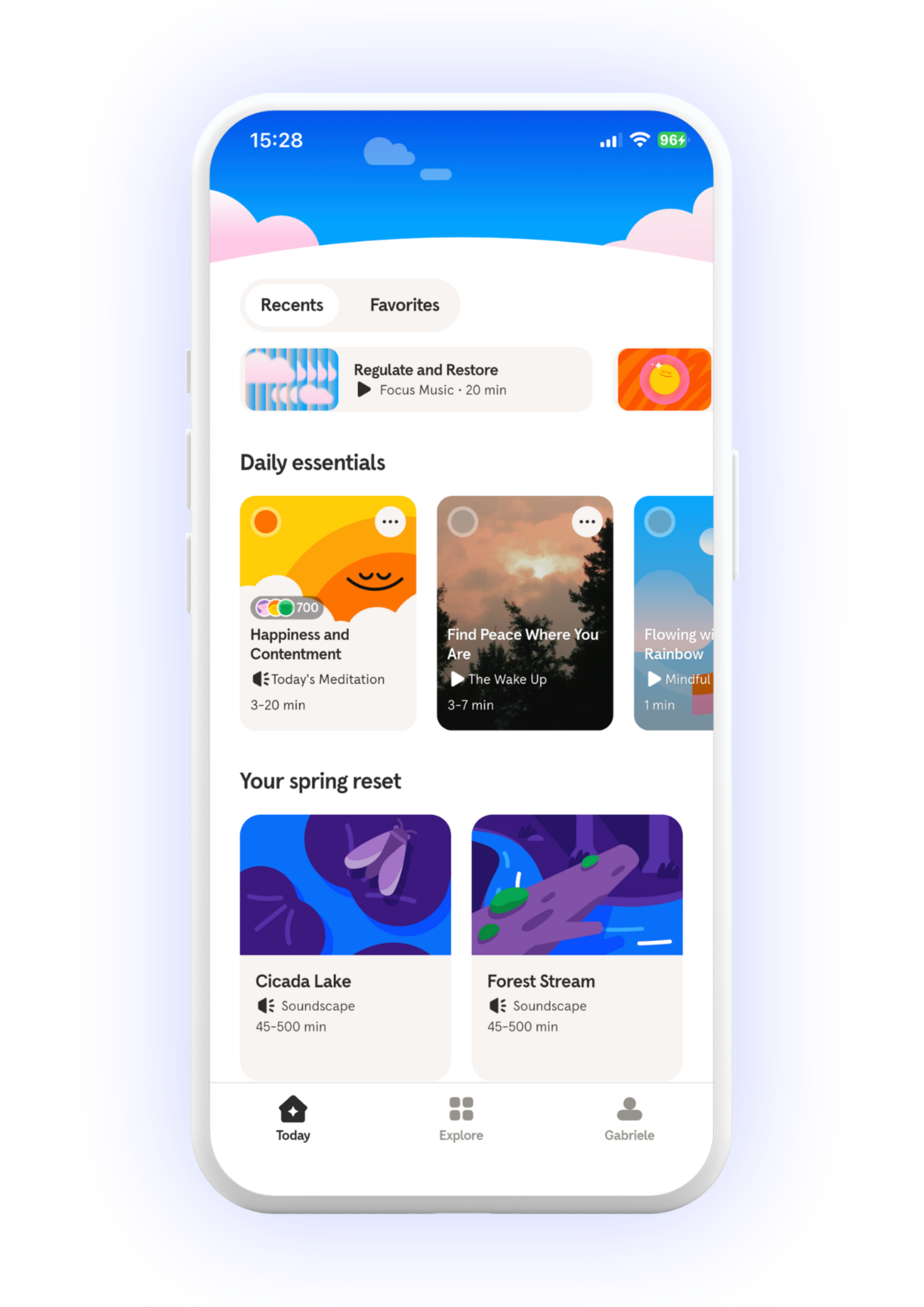
Example in the image: the first things visible are “Recents,” “Favorites,” then multiple content sections below.
Why this fails: nothing on the screen answers
What should I do now?
Where do I start?
What is best for me right now?
The page begins with navigation and content containers, not with guidance.
The landing page offers access points, but not an entry point. -
Example in the image: sections such as “Daily essentials” and “Your spring reset” appear before the app understands or asks what the user actually needs.
Why this fails: the user came to relax, but the screen does not ask:
Do you want to unwind?
Are you stressed?
Do you want meditation, music, or sleep support?
How much time do you have?
Instead, the system says, in effect: “Here is our content.”
The information architecture is content-led rather than need-led. -
Example in the image: within one screen, the user sees:
top tabs
a recent item strip
several cards under “Daily essentials”
more cards under “Your spring reset”
bottom navigation
Why this fails: many elements compete for attention at once, and none is clearly dominant. A sporadic user must scan, compare, and decide manually.
The homepage creates decision friction by presenting too many equally plausible paths. -
Example in the image: the Recents/Favorites toggle, the small horizontal audio card, the large section headers, and the content cards all share attention without a strong primary CTA.
Why this fails: there is no single, obvious focal point. The eye moves around the page, but the page does not direct the user toward one recommended next action.
The interface lacks a dominant action and therefore fails to guide attention effectively. -
Example in the image: titles like:
“Happiness and Contentment”
“Find Peace Where You Are”
“Cicada Lake”
“Forest Stream”
Why this fails: these titles sound pleasant, but they do not help the user quickly answer:
Is this guided meditation or passive audio?
Is this good for stress relief?
Is this best for unwinding after work?
Is this the right 20-minute choice for me?
The user has to interpret poetic naming instead of being supported with plain-language decision cues
The content labels are expressive, but they do not support fast, confident choice-making. -
Example in the image: durations shown include:
20 min
3–20 min
3–7 min
45–500 min
Why this fails: the app exposes duration as metadata, but does not help the user use time as a decision tool. Someone with 15–30 minutes still has to manually sort through incompatible options.
The 45–500 min soundscapes are especially mismatched for a quick-entry relaxation use case, yet they occupy prominent space.
Time is displayed passively instead of being used to actively guide session selection. -
Example in the image: the page mixes:
focus music
meditation
short guided content
long soundscapes
All inside the same browsing flow.
Why this fails: these formats serve different intentions and require different levels of commitment. A sporadic user does not know whether they should choose a guided session, ambient background audio, or a thematic program.
The homepage blends distinct content modes without helping the user understand which one fits their current need. -
Example in the image: the first interactive control near the top is the Recents / Favorites toggle.
Why this fails: this assumes the user remembers what they used before or wants to re-enter an existing pattern. A sporadic user often does not remember prior sessions clearly and may not want to resume old content.
The entry experience privileges past behavior over present intention. -
Example in the image: there is no welcoming or supportive copy such as:
How are you feeling today?
What do you need right now?
Ready to unwind?
Continue gently from where you left off
Why this fails: for a wellbeing app, the emotional tone is surprisingly passive. The app shows inventory, but does not acknowledge the user’s state, mood, or reason for opening it.
The landing page lacks emotional guidance and does not make the user feel seen.
02 Ideate
·
02 Ideate ·
Wireframe and UI ideation

03 Design
·
03 Design ·
Designed in Figma with Stitch
04 Learnings
·
04 Learnings ·