Lejlac – responsive Webshop
Problem
Users were curious about the product but hesitant to purchase because they didn’t clearly understand what it was, how it should be used, or whether it was socially appropriate. This ambiguity created decision friction.
Goal
Design a product experience that reduces ambiguity and social hesitation by clearly communicating what the product is, how it’s used, and when it’s appropriate—enabling users to make confident purchase decisions without external explanation.
Increase in conversion rate
Reduction in user hesitation
Faster, more confident decision-making
Webshop – UX/UI Case Study
Role: UX/UI Designer, Physical Designer, Marketing
Duration: 7 years
Team: 1 designer
Tools: Shopify, Canva, Adobe, Figma
Background
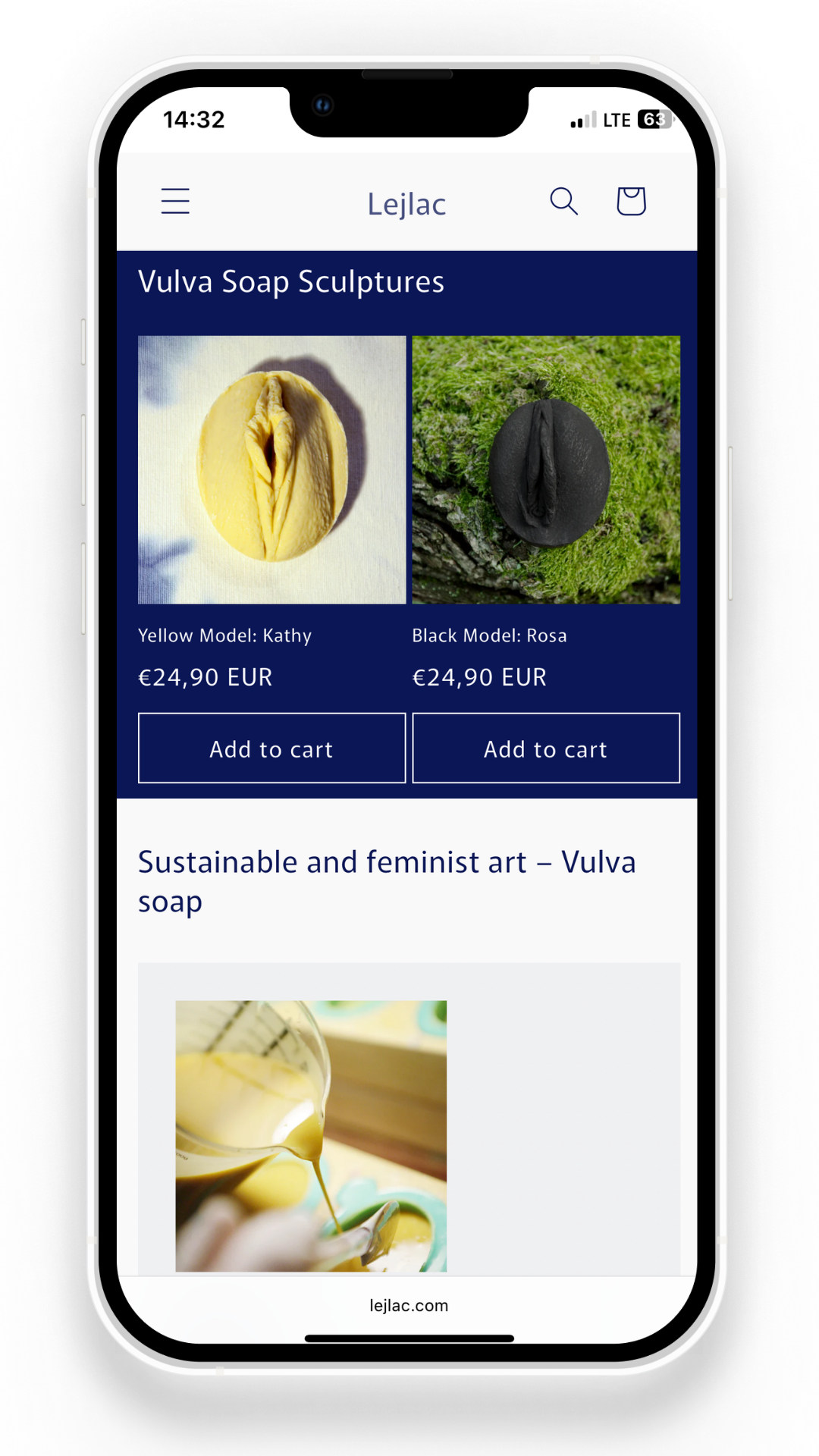
I created Lejlac, a 0→1 product combining art and self-care, introducing a new and unfamiliar product category.
To make it accessible beyond in-person interactions, I designed and built an e-commerce experience (Shopify) to reach a broader audience and enable direct purchase.
What I did
I owned the end-to-end experience:
Product creation and positioning
UX and structure of the webshop
Iteration based on real user feedback (online and in-person)
What I Accomplished
The product gained attraction across multiple channels, including press coverage and distribution through museums, retail, and hospitality spaces.
Featured in international media including The New York Times.
Insight
Users didn’t need persuasion—they needed clarity and reassurance.
The main barrier wasn’t lack of interest, but uncertainty around what the product is, how it’s used, and whether it’s appropriate.
Curiosity alone didn’t lead to purchase
Social hesitation slowed decision-making
In-person explanation consistently triggered conversion
Strategy
I explored different ways to reduce hesitation while maintaining the product’s identity:
Artistic ambiguity → strong identity, low clarity ❌
Educational framing → clear, but lost emotional value ❌
Guided clarity → clarity + meaning → best practice ✅
Design Iterations


Iteration 1 — Art-first exploration
Approach: Visual storytelling first
Outcome: High curiosity, low clarity
Learning: Users didn’t know how to act
What worked
Strong visual identity
Clear emotional tone
High-quality imagery
What didn’t
Lack of clarity on product and purpose
Weak information hierarchy
No clear path from interest → action
Key takeaways
A strong brand impression created curiosity, but without clear structure and guidance, users were unable to confidently understand or purchase the product.

Iteration 2 — Brand identity first
What improved
New very long user journey
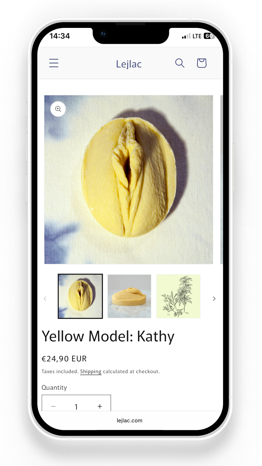
Stronger and more consistent CTAs
Better product visibility (pricing, options)
Added trust signals (e.g. “Seen in”, FAQ)Iteration 2 — Art-first exploration
Approach: Visual storytelling first
Outcome: High curiosity, low clarity
Learning: Users didn’t know how to act
What worked
Strong visual identity
Clear emotional tone
High-quality imagery
What didn’t
Lack of clarity on product and purpose
Weak information hierarchy
No clear path from interest → action
Key takeaways
A strong brand impression created curiosity, but without clear structure and guidance, users were unable to confidently understand or purchase the product.
Iteration 3 — Balanced clarity + structure
What improved
Clearer and more structured user journey, much shorter
Stronger, more consistent calls-to-action
Improved product visibility and pricing clarity
Added trust signals (e.g. “Seen in”, FAQ)
What didn’t work
Messaging still partially abstract
Content hierarchy still competing for attention
Visual system not fully consistent
Limited guidance for choosing between options
Key takeaways
Structural improvements reduced friction, but users still lacked clear guidance and confidence when making decisions.
Learning
UX Decisions
Reordering information hierarchy
Moved products to the top to reduce friction between interest and action
Reducing cognitive load
Removed elements that didn’t directly support decision-making
Translating conversations into UX
Converted in-person explanations into structured product framing
Outcomes
Conversion improved from ~3% to ~5% (~66% increase)
Additional signals:
fewer clarification questions
faster decision-making
higher engagement at market
Reflection
I initially underestimated the level of hesitation and social discomfort around the product.
Over time, I learned that designing for unfamiliar or sensitive topics requires more than clarity—it requires creating confidence and psychological safety.
Continuous feedback from real users helped me move beyond assumptions and design based on actual behavior.
This experience shaped how I approach UX today: as an iterative process of learning, testing, and refining until users feel confident enough to act.
Thanks for taking time to get to know me!